Watch Dogs 2 Logo: Design Secrets and DedSec Branding
Discover the secrets behind the Watch Dogs 2 logo, DedSec's visual identity, and how to use these assets for your own creative hacker-themed projects.
Published:
Table of Contents
The watch dogs 2 logo is more than just a corporate trademark; it represents the vibrant, chaotic, and rebellious spirit of the DedSec hacker collective in San Francisco. When Ubisoft transitioned from the dark, rainy streets of Chicago in the first game to the sun-drenched, tech-saturated Bay Area, the watch dogs 2 logo underwent a massive stylistic overhaul to match this new energy.
Understanding the visual language of this sequel is essential for fans, graphic designers, and modders alike. The game’s identity is built on a foundation of "glitch art" and low-fidelity aesthetics that mirror the DIY nature of underground hacking groups. In this comprehensive guide, we will break down the design elements of the iconic branding, provide technical specifications for creators, and explore why this specific visual identity remains a hallmark of open-world game design.
Quick Answer
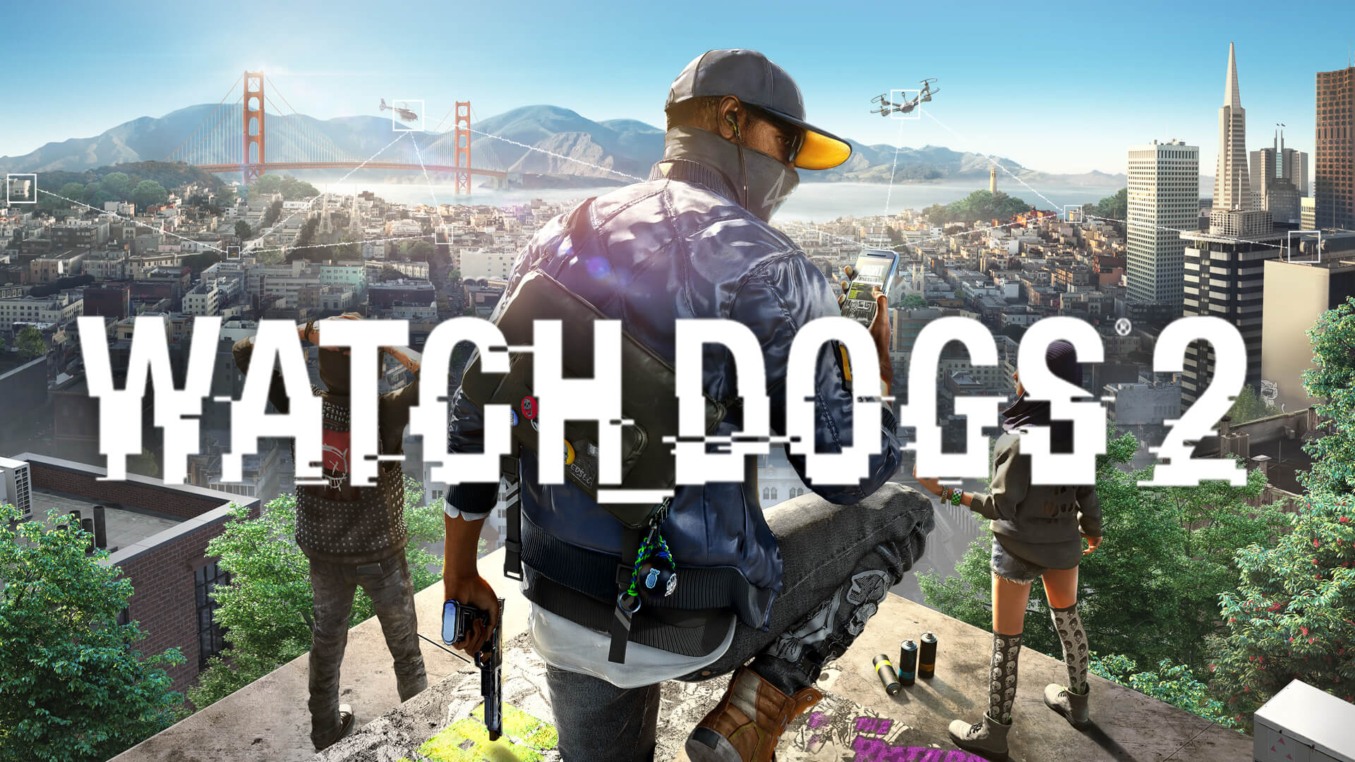
The watch dogs 2 logo features a stylized, glitch-inspired font that emphasizes connectivity and digital disruption. Unlike the minimalist approach of the original game, the sequel uses a "DedSec" aesthetic characterized by neon colors, distorted pixels, and ASCII-inspired iconography.
The Evolution of the Watch Dogs Visual Identity
The shift from the original Watch Dogs to the sequel was not just mechanical; it was aesthetic. The first game’s logo was clean, sharp, and corporate, reflecting the cold, surveillance-heavy atmosphere of Chicago. In contrast, the watch dogs 2 logo embraces the messiness of a digital revolution. It reflects the personality of Marcus Holloway and his crew—young, tech-savvy, and unapologetically loud.
According to community reports and developer interviews from Ubisoft, the goal was to make the branding feel like something a hacker could spray-paint on a wall or stencil onto a laptop. The "glitch" effect isn't just for show; it represents the fragility of the systems Marcus is hacking. The lines are intentionally broken, and the kerning (spacing between letters) feels slightly off-kilter to evoke a sense of digital instability.
Feature
Watch Dogs (Original)
Watch Dogs 2
Primary Theme
Surveillance & Revenge
Rebellion & Connectivity
Visual Style
Minimalist / Corporate
Glitch Art / DIY Punk
Color Palette
Black, White, Grey
Neon Blue, Yellow, Pink
Font Type
Sans-serif, Clean
Distorted, Stenciled
Symbolism
The "Fox" (Aiden Pearce)
The DedSec Skull / Connectivity Nodes
Breaking Down the Design Elements
The watch dogs 2 logo consists of several distinct layers. If you are a designer looking to recreate this look, you need to pay attention to the specific "artifacts" that make the logo feel authentic to the game's world.
The Connectivity Nodes
If you look closely at the "D" and "G" in the logo, you’ll notice small circular nodes connected by thin lines. This is a direct reference to the "NetHack" view in the game, where players see the world as a series of interconnected data points. It reinforces the theme that everything in San Francisco is vulnerable if you know where the nodes are.
The Glitch Effect
The logo uses a technique known as "pixel sorting" or "displacement mapping" in its static form. This gives the impression that the image is being viewed on a corrupted monitor. For creators, achieving this look usually involves duplicating the text layer, shifting the RGB channels (Red, Green, and Blue) slightly to the left or right, and adding horizontal scanlines.
Color Theory and DedSec Yellow
While the logo itself is often presented in stark white or black, it is frequently paired with a specific shade of vibrant yellow. This color was chosen because it stands out against the blue skies of San Francisco and the dark UI of a terminal screen.
Color Name
Hex Code
RGB Value
Usage
DedSec Yellow
#FDF001
(253, 240, 1)
UI Highlights, Accents
Hacker Blue
#00AEEF
(0, 174, 239)
Connectivity Lines
Glitch Pink
#EC008C
(236, 0, 140)
Error States, Distortions
Terminal Black
#1A1A1A
(26, 26, 26)
Backgrounds, Shadowing
How to Source High-Quality Assets
For fans looking to use the watch dogs 2 logo for desktop wallpapers, cosplay props, or stream overlays, finding the right file format is crucial. Using a low-resolution JPEG will result in "artifacting" that ruins the clean glitch lines of the design.
Official vs. Community Resources
Ubisoft occasionally releases "Fan Kits" which include high-resolution transparent PNGs and vector files. However, many of the best assets come from player experience and community contributions on platforms like DeviantArt or specialized gaming forums.
Vector Files (SVG/EPS): Best for printing on t-shirts or large posters. Because they are based on mathematical paths rather than pixels, they can be scaled infinitely without losing quality.
Transparent PNGs: Ideal for digital use. These allow you to place the logo over any background without a white box appearing around it.
Brush Packs: Many community designers have created Photoshop brushes that mimic the specific "glitch" textures found in the game.
Check the Steam Community Hub
The Watch_Dogs® 2 on Steam community hub often has a "Media" or "Artwork" section where players upload high-fidelity recreations of in-game assets, including the DedSec skull and the main game logo.
Creating a DedSec-Inspired Logo: A Step-by-Step Guide
If you want to create your own branding that captures the essence of the watch dogs 2 logo, follow these steps based on common graphic design workflows used by the community.
Step 1: Choose the Right Typeface
Look for "stenciled" or "distorted" sans-serif fonts. Fonts like Agency FB or Impact can serve as a base, but you will need to manually modify them to get the "hacker" look.
Step 2: Apply the "Slicing" Effect
Using a marquee tool, select thin horizontal strips of your text and shift them slightly to the side. This mimics the look of a digital signal dropping out.
Step 3: Add Connectivity Nodes
Place small circles at the terminals of your letters. Connect these circles with thin, 1-pixel lines. This is the "signature" look of the Watch Dogs series.
Step 4: Chromatic Aberration
This is the secret sauce. Duplicate your logo layer twice. Color one layer pure Red and the other pure Cyan. Set their blending modes to "Screen" and nudge them 2-3 pixels in opposite directions. This creates the "shimmering" effect seen in the game's menus.
Step
Action
Tool Recommendation
Expected Result
1
Base Text
Adobe Illustrator / Inkscape
Clean vector foundation
2
Distort / Slice
Photoshop / GIMP
"Broken" digital appearance
3
Add Nodes
Pen Tool / Shape Tool
Thematic "connectivity" look
4
RGB Shift
Channel Mixer
High-energy glitch effect
The Cultural Impact of the Logo
The watch dogs 2 logo did more than just sell a game; it influenced a specific sub-genre of "tech-wear" and digital fashion. The DedSec skull, often paired with the logo, became a symbol of online anonymity and hacktivism in popular culture.
In the years following the game's release, the aesthetic seen in the logo influenced everything from music video visuals to other cyberpunk-themed media. The "glitch" isn't seen as a mistake anymore; it's seen as a deliberate stylistic choice that communicates complexity and subversion.
Why the Logo Works for Players
Instant Recognition: The unique font and node structure are identifiable even from a distance.
Thematic Consistency: The logo feels like it belongs inside the game world, appearing on everything from billboards to Marcus's phone.
Versatility: It looks just as good in bright neon colors as it does in monochrome.
Common Mistakes When Using the Logo
When incorporating the watch dogs 2 logo into fan projects, there are a few common pitfalls to avoid. Based on community feedback, these are the most frequent errors:
Over-Glitching: If you add too many distortion effects, the text becomes unreadable. The official logo maintains a balance between "broken" and "legible."
Incorrect Proportions: The "Watch Dogs" text is usually larger than the "2," but they must share the same baseline to feel balanced.
Using the Wrong "2": The "2" in the logo is specifically styled to look like a digital numeral. Using a standard font for the number often looks out of place.
Avoid Low-Quality Rips
Never use a logo pulled directly from a screenshot of the game. These often contain compression artifacts that become very obvious when you try to apply filters or resize the image for a project.
Technical Specifications for Modders
For those working on mods for the Steam version of the game, replacing textures requires an understanding of how the game handles transparency and UI scaling. The watch dogs 2 logo used in the main menu is typically stored as a .dds (DirectDraw Surface) file, which supports alpha channels for transparency.
Asset Type
Resolution
File Extension
Notes
Main Menu Logo
2048x1024
.dds / .tga
Requires DXT5 compression
HUD Icon
256x256
.png
Must be perfectly centered
World Texture
Variable
.dds
Used for graffiti and posters
By following these technical guidelines, modders can ensure that their custom logos look as crisp as the original Ubisoft assets. Whether you are building a custom mission or just want to reskin Marcus's gear, staying true to the original design principles of the watch dogs 2 logo is key to maintaining the game's immersion.
FAQ: Everything You Need to Know About the Watch Dogs 2 Logo
Where can I download the official Watch Dogs 2 logo?
The best place to find high-quality assets is through the official Ubisoft press kit or the community-driven media sections on the Steam store page. Avoid third-party "wallpaper" sites that may host low-quality or malware-infected files.
What is the font used in the Watch Dogs 2 logo?
The logo uses a custom-designed typeface. However, fonts like "Hacked" or "DeadSec" (community-created fonts) are very close approximations that you can use for personal projects to achieve a similar look.
Can I use the Watch Dogs 2 logo for my YouTube channel?
Generally, Ubisoft allows for "Fair Use" in terms of gameplay videos and fan content. However, you cannot use the watch dogs 2 logo to imply an official partnership or to sell unauthorized merchandise. Always check the latest EULA for specific copyright guidelines.
How do I make the logo look like it's "flickering"?
To create an animated version of the watch dogs 2 logo, you can use software like Adobe After Effects. Apply a "Wiggle" expression to the opacity and use the "Venetian Blinds" effect to create scanlines that appear and disappear randomly.